Video files look different on different devices. (ANSWERED)

You spend hours working on footage, you get it perfect, it looks amazing. Export…and now it looks like trash. Why?

Different devices work in different color spaces with different pixel shapes and sizes. All of these things affect how color looks. Sony devices tend to handle blues and greens exceptionally well, whereas Apple devices display a much broader variety of greens and significantly more yellows.

Canon monitors & sensors do yellows and African American skin tones very well, whilst other monitors may make skin tones appear more “muted” and grey. In addition, your phone likely has smaller pixels / higher pixel density. This will make the details look sharper.

A more explicit example from a 15โ€ณ MacBook Pro has a 10-bit 2880×1800 display (can display a little over 1.1 million different colors at 220 pixels per inch covering 99% of the sRGB color space), but a Dell XPS 15 with the 4K UHD (3840×2160) is just a 6-bit display (can display only 262 thousand colors but with 282 pixels per inch and covers 95% of the sRGB color space) โ€” cheaper displays are even worse are reproducing color (source: James McInnis)

3 THINGS TO CHECK

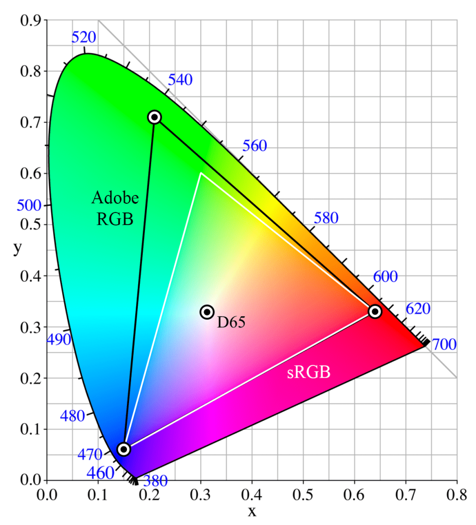
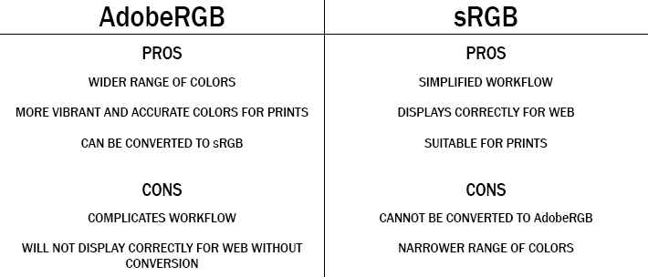
  1. COLOR GAMUT – Color Spaces are important to understand. Most consumer television / monitors are on the sRGB color space, whilst Apple devices are on the adobe RGB color space.

    Adobe RGB has a wide variety of colors that gives a way more accurate image, but it is important to note that it is not always best final product as web 2.0 only allows for sRGB and it is viewed as the universal standard.

    It is usually a good practice to start a project in adobe RGB, and save a copy that is converted to sRGB.
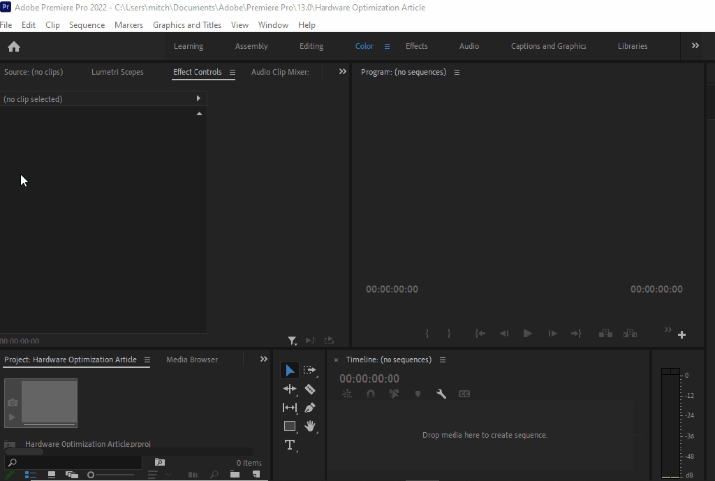
  1. HARDWARE OPTIMIZATION – No surprise here that hardware optimization is one of the first things to check, it makes a huge difference in render previews. If you have noticed a difference between what you have exported vs what you are seeing in the preview, this is the reason.

    If your issues are color related, you are looking for the place to check is in: Edit > Preferences > General settings.
  1. COLOR PROFILES & MANAGEMENT – REC. 709 is the standard for all SDR video productions. Rec. 709 displays the same amount of colors as sRGB yet it has a defined gamma of 2.4 (BT.1886), a peak luminance (brightness) of 100 nits, and a D65 white point.

    Why is that important? Because these units are best for cross-platform color calibration. MOST MONITORS prosumer included have a much cooler white point. Why? (Insert corporate greed quote here).

    Rec. 2020 is fairly new, and a lot of filmmakers choose this option because of the vast upgrade in amount of visible colors. On the flipside, it has caused minor disruptions in the post process pipeline as it clashes with current-gen tech.

There you have it! There are other things you can look into but when managing these 3 very common discrepancies you can usually resolve any issues relating to displaying footage amongst many devices. There could also be calibration issues with your monitor.

If you suspect that is the case, you should check out our article on monitor calibration for Mac & PC.

Written by Cornell Mitchell, 7/4/2022

How to Properly Calibrate a monitor (Mac & PC)

(4/24/2022)

Out of the box, its unlikely your monitor is properly calibrated. Even Macs with a retinal display can drift out of calibration after repeated power surges, thousands of On/Off cycles and years of letterboxing from daily streaming activities.

It’s strange but there are hundreds of factors that can affect screen calibration over time. So much so, that on most professional sets camera sensors and screens are calibrated daily to maintain peak integrity between days and shooting conditions.

Luckily there are many free ways to address monitor calibration that all yield good results. You can either calibrate by eye, or by using a device called a colorimeter. If you have a colorimeter, you probably know how to use it. If not, we have another article on how to use it if its your first time operating.

One thing to bear in mind before you start any calibration is to know what you are calibrating for. A lot of technology systems use the RGB color space. Mac and higher end phones and cameras may use Adobe RGB, which displays more greens and yellows than standard RGB. The guide below illustrates this.

BLACK TRIANGLE: Adobe RGB
WHITE TRIANGLE: sRGB
sRGB Color Space. Public Domain image.

As you can see, Adobe RGB has more colors. If you are working on a movie or photo that was colored in Adobe RBG, viewing on a monitor only capable of RGB…results may be different or unexpected. This is especially important when collaborating between departments or the various stages of production leading up to color.

Before you start to calibrate:

  • Let your monitor warm up for 30 minutes
  • Make sure its in its native resolution…or the highest resolution it supports.
  • If you are on an older device that plugs into any cable other than an HDMI cable, you need to start with a brand new cable.
  • Well-calibrated mid-tones should be the highest priority. These tones are the first thing people usually notice.
  1. DEFAULT OS CALIBRATION – In Windows & Mac, there are utilities available for free that offer for some quick and basic calibration.

    WINDOWS: Search for “calibrate display color” and you should be taken to a menu that offers simple step-by-step instructions on how to get your monitor closer to true color. It’ll walk you through gamma, brightness and contrast, and color balance, and before finishing offer you the opportunity to turn on ClearType, which attempts to make things “sharper.”

    MAC OSX:  Go to System Preferences > Display and click on the Color tab. Next, click the Calibrate button.  Display Calibrator Assistant will open, and offer you the option to use “Expert Mode”. This option allows you to better fine tune white points and gamma, or luminance.
  1. HARDWARE SETTINGS – Sometimes, settings on monitors themselves are changed. Often-times there is a tendency to increase contrast which usually allows for seemingly more definition, however this can result in artifacts, crushed blacks, or exaggerated shadows. This is usually one of the last things we adjust.

    Older and cheaper monitors use lower-quality diodes and silicon that often deteriorates faster. This deuteriation may cause irreversible tinting issues but you can force the hardware into giving you a more accurate image.

    You can start by using the Lagom LCD monitor test pages and cycling though the menu setting on your monitor for a variety of settings. Even utilizing a few settings can help bring out the best in your monitor.

    Cambridge in Color, has a great tutorial that will help show you exactly what to look for.
  1. SOFTWARE-BASED CALIBRATION. This option yields mixed results. If its a hardware issue, you may not fix the issue with ay of these programs. Both programs we list have helped various clients with various literacy when it comes to technology and are what we have designated in-house for calibration.
  • NaturalColorPro. This is a great, free program that’s actually made by Samsung. Its ideal if you want noticeable improvements, fast. It takes into account types of screens as well, CRT, LCD, etc.

    You can also use it on consumer TV models. The only real issue is that its Windows only.

  • DisplayCAL. This is a more professional program that allows you to measure and calibrate your monitor with the use of a colorimeter. It has vast options available and we actually use this program to design luts to load onto our field monitors for on-set work. There is an option to use it without a colorimeter but we have not personally tested it.

This is just the tip of the iceberg when it comes to color, but should be enough to get you started! All-in-all, its nice knowing with confidence that you are looking at true color, and seeing footage for what it really is and as artists, and yourself alike, have intended.